The Philosophy Behind Designing a Sim
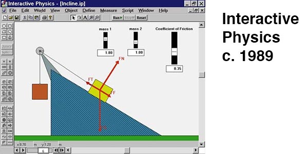
Physics simulations have been around for a long time. Since the earliest days of computer programming, physicists have been using the powers of computer generated graphical visualization to make models of physical phenomena, both for education and fundamental research.
What follows are a few design principles to keep in mind when building a sim for the DIY Science Sims collection.
Clarity
The sim should be conceptually clear. This seems obvious, but I’ve seen many cases of science visualizations that are at first glance confusing. What is clarity? I don’t know, but I know when something is not clear.
Design Principle: Clarity is the prime goal.
The Science
Visualizing abstract concepts is what the sims are intended to do. When building a sim, make sure your sim has a clear answer to question: “what is this demonstrating?” Or, “what am I supposed to learn from this?” If you can’t answer these questions, then the sim isn’t going to be useful. Also, the science the sim shows should be true!
Design Principle: Make sure the sim helps with a concept. Why should a learner interact with it? What will they get out of it? Make sure these questions have answers!
Scope
The goal of these sims is not to create a fully functioning simulated lab or physical simulation. Other groups do that. For example, the phet sims are built with the goal of being able to reproduce an entire physics lab on the screen. I know it’s tempting to keep adding buttons and sliders and other features to a sim. However, use restraint. Keep them simple.
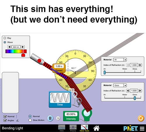
Our sims our designed to do one thing and to do that one thing well and with as much clarity as possible. Think of them as Haikus – as opposed to epic poems like the Odyssey.
Design Principle: A sim should be explainable in a sentence. If it takes a full paragraph (or more) to explain all the elements of the sim, then it should be broken up into smaller modules.
Usability
The point of the sim is to help understand a concept from science, so we don’t want to complicate this by demanding the user also figure out how to use the sim in addition to learning the physics. A sim should be simple enough that a user can look at it and know immediately what to do. Some specifics:
- Unless it is absolutely necessary, keyboard entry should be avoided. Requiring left or right arrows for example will leave mobile users stranded with a broken sim. Instead, sliders or buttons can be used to do the same thing.
Design Principle: A user should look at a sim and know (nearly) immediately what to do. They might not understand the science behind it yet, but they shouldn't struggle with learning the interface.
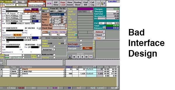
Design
By having a unified design, we can reduce the cognitive load experienced by the user. We have a stylesheet to create consistent buttons and other input elements. All the ‘design’ elements should be there for a reason. Even if a design element looks cool it should not become a distraction from the science of the sim.
- Backgrounds should be white.
- Exception: doing a space sim? Then maybe outer space should be black.
- Lines and text should be black.
- Exception: if color is needed to identify differences, then use it.
- Keep the amount of text needed to a minimum.
Design Principle: Every pixel should have a reason for its existence. No superfluous design elements. No clutter.